

Your Med Spa Website Has 8 Seconds to Earn Trust. Here's What It Needs to Convert
A visitor lands on your med spa's website after searching "Botox near me" or tapping the link in your Instagram bio. You have roughly eight seconds before they decide whether to stay or bounce to the next clinic in the search results.
That's not enough time for a mission statement. It's enough time for a clear promise, a real photo, and an obvious next step. Most aesthetic clinic websites lose visitors not because the treatments aren't good, but because the site doesn't do the one job it actually has: turn a curious visitor into a booked consultation. Below is the exact checklist we run every clinic site through during a conversion audi and the framework behind the 5-page website every Founding Clinic client gets as part of onboarding with RBE.
1. An Above-the-Fold CTA That Doesn't Make People Think
The section of your homepage visible before anyone scrolls needs to do three things and nothing more:
What you do, in plain language ("Botox, Fillers & Laser Treatments in Atlanta"), not a tagline like "Redefining Beauty"
Why you're credible, a one-line trust cue, such as "Board-Certified Providers"
One clear action, a single, visually distinct CTA button, not five competing links
If a visitor has to scroll to figure out what your clinic does or how to book, you've already lost a meaningful share of that traffic. The CTA button should repeat at logical intervals down the page and should never require a phone call as the only booking option high-intent clients increasingly want to book a consultation from their phone without talking to anyone first.
2. A Before-and-After Gallery That's Actually Believable
This is the single highest-converting element on a med spa website, and also the most commonly done wrong. What builds trust:
Consistent lighting and angle between before/after pairs mismatched lighting reads as manipulated even when it isn't
Treatment tags on every photo (which service, and sometimes how many sessions)
Real patients, real results stock "after" photos are easy to spot and quietly destroy credibility
A filterable view so visitors can jump straight to the treatment they're considering (lips, jawline, skin texture, etc.)
A gallery buried three clicks deep on a hidden page won't get used. It needs a visible link from the homepage and, ideally, a preview module embedded directly on the relevant services page.
3. Trust Signals, Placed Where Doubt Naturally Shows Up
Aesthetic treatments are a high-trust purchase people are deciding who gets to alter their face. Trust signals need to appear right where hesitation peaks, not just get dumped in a footer:
Provider credentials (RN, NP, MD, board certifications) placed near the booking CTA
Google review count and star rating visible on the homepage, not just linked out
Before/after results shown near the service description they support
Licensing, insurance, or association badges (state board, ASPS, AAFPRS, etc.) where applicable
Real clinic photos your actual space, not generic stock interiors
The goal is to answer "can I trust this person with my face?" before the visitor ever has to consciously ask it. Trust signals work best when they're specific rather than generic "500+ five-star reviews" and "12 years in practice" carry more weight than a vague "trusted by thousands" claim, because specificity reads as verifiable and vague claims read as marketing.
4. Mobile UX That Doesn't Fight the Visitor
The majority of med spa traffic arrives on mobile from Instagram, from Google Maps, from a text a friend sent. If your site isn't built mobile-first, you're losing bookings silently. Non-negotiables:
Tap targets (buttons, phone numbers) sized for thumbs, not cursors
Click-to-call phone numbers that actually work
A booking widget that doesn't require pinch-zooming to use
Forms with as few fields as possible name, phone, and treatment interest is often enough
No pop-ups that are difficult to close on a small screen
It's worth testing your own site the way a first-time visitor would: pull it up on your phone on cellular data, not office WiFi, and try to book a consultation using only your thumb. Any point where you hesitate or have to zoom in is a point where a real visitor drops off.
5. A Booking Widget That Removes Friction, Not Adds It
"Call us to book" is a conversion killer for a generation that avoids phone calls entirely. Your booking flow should:
Live directly on the page, not link out to a clunky third-party portal that looks nothing like your site
Show available times without requiring an account to be created first
Confirm the booking instantly, with a text or email receipt
Offer a "not sure yet? Ask a question" fallback for visitors who aren't ready to commit to a time slot
If your booking widget is the reason someone gives up, nothing else on this checklist matters. See how a streamlined flow looks by booking a call with our team we'll walk you through the exact widget we build into every clinic site.
6. Load Speed That Doesn't Cost You the Visitor Before They Even See the Page
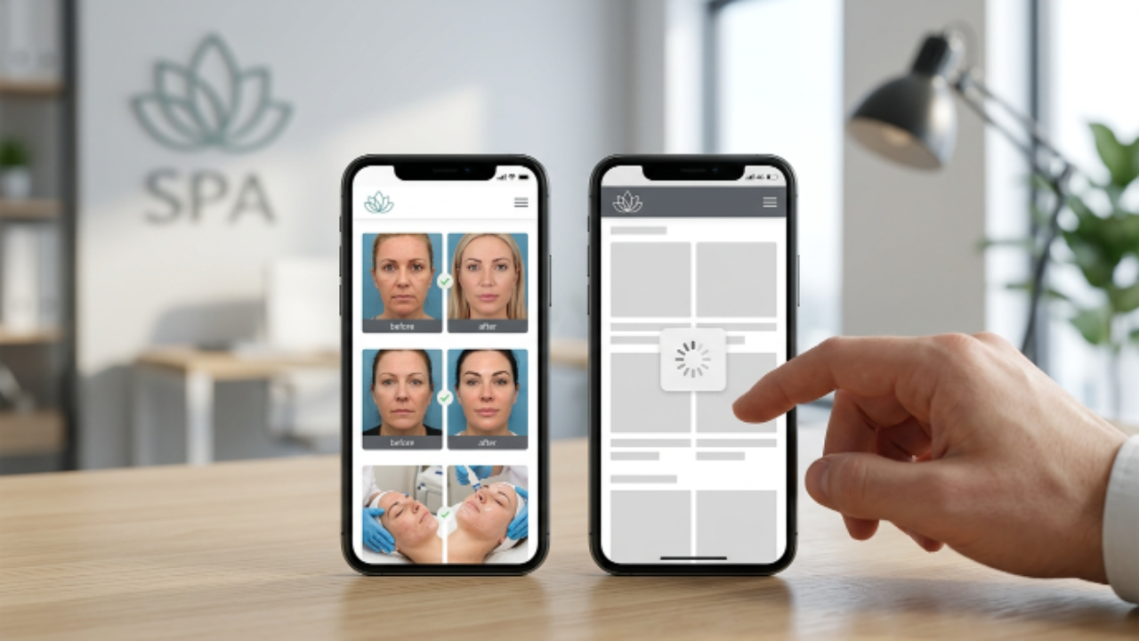
Everything above is irrelevant if the page hasn't finished loading. Aesthetic clinic sites are especially prone to slow load times because of image-heavy before/after galleries. Fixes that matter most:
Compress and properly size every image before/after photos are usually the worst offenders
Lazy-load galleries below the fold instead of loading every image at once
Avoid autoplay video hero sections unless heavily optimized
Test on mobile 4G speeds, not just office WiFi
A one-second delay in load time is a measurable hit to conversion rate. For a med spa where the average visitor is comparing you against two or three other clinics in the same search results, that second matters more than almost anything else on this list.
The Bottom Line
A med spa website isn't a brochure it's a 24/7 consultation booker. Every section on the page should be doing one job: moving a visitor closer to booking, or removing a reason they might not.
If you're auditing your own site against this list and finding gaps, that's normal most clinic websites were built to look good, not to convert. Founding Clinic clients get a complete, conversion-ready 5-page website built during onboarding, designed around every item on this checklist from day one. Compare packages on our pricing page, or book a call to see where your current site is losing bookings.
Get a conversion-ready website with RBE Book a Call
Frequently Asked Questions
How much does a med spa website redesign typically cost?
Cost depends on scope a 5-page conversion-focused site is a very different project than a full custom build with e-commerce or membership features. See current packages on our pricing page or book a call for a quote based on your clinic's specific needs.
Do I need a separate landing page for each treatment?
Generally yes. Dedicated pages for core treatments (Botox, fillers, laser, etc.) let you target specific search terms and let visitors self-select into the service they actually want, rather than landing on a generic "services" page and having to hunt for relevant information. See how we structure these on our services page.
How many before-and-after photos should my gallery include?
Quality and consistency matter more than volume. A tightly curated set of 15–20 photos with consistent lighting and clear treatment tags will convert better than 100 inconsistent, uncredited images.
Should I use a third-party booking platform or build booking into my site?
Either can work, but the experience needs to feel native visitors shouldn't notice they've left your site. If your current platform breaks that continuity or adds extra steps, it's likely costing you bookings.
How long does it take to build a conversion-optimized med spa website?
Timelines vary by scope, but a 5-page site built around this checklist can typically move from kickoff to launch within a few weeks. Book a call to get a timeline specific to your clinic.
Will a new website actually improve my SEO rankings, or just conversions?
Both, if it's built correctly. Fast load speeds, mobile usability, and clean internal linking between your homepage, services page, and treatment pages are ranking factors in their own right so the same structure that helps visitors convert also helps Google understand and rank your site. A redesign focused only on aesthetics, without these fundamentals, tends to underperform on both fronts.